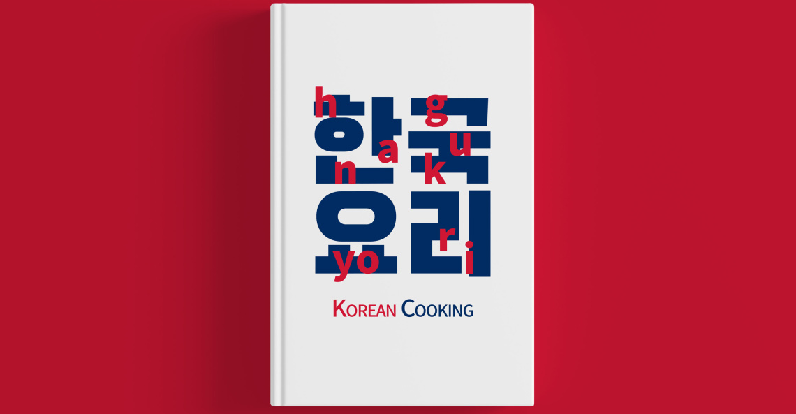
On one of the projects for my final year we were tasked by Professor Phil Cleaver to produce designs for a cookbook. Due to my great interest and passion of exploring Korean culture, I decided to delve into the world of Korean foods. The brief was to focus on the design rather than the fact that it was a cookbook. This was great as it allowed myself to play to my strengths of the art and aesthetics, rather than having to be confined to certain parameters.
I decided to take my inspiration from new Korean Wave Swiss inspired design and a South Korean Typographer Ahn Sang-Soo who loved to arrange type, image, and shape to produce his outcomes. I combined this with the colour theming of the South Korean flag ‘Taegeukgi’. This minimalist structure allowed the raw elements of the design and the type to speak for themselves and display a clean aesthetic.
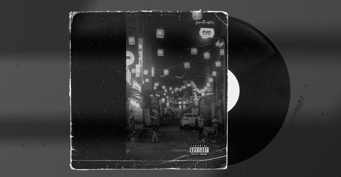
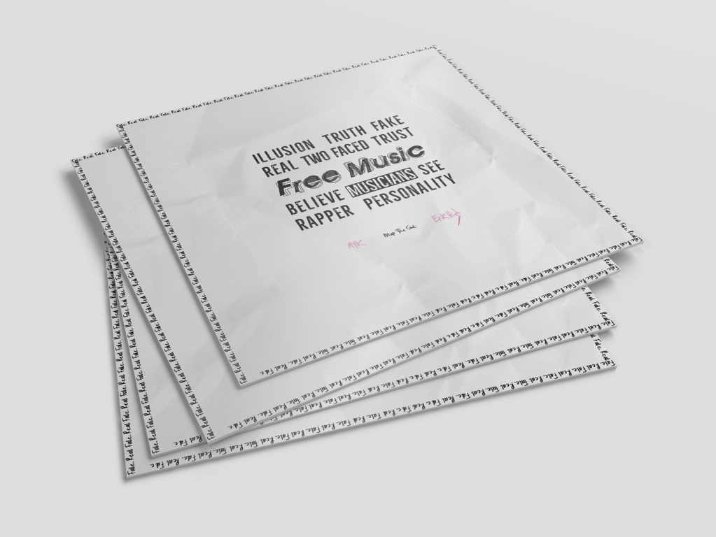
The other two projects that I have also included in the show are, one about designing packaging for a premium vinyl and the other also ended up being a vinyl cover design, however this focused more on typography and the conveying of music through type. Since I was already theming my work around Korean culture, I decided to add both of these projects to that area as well.


